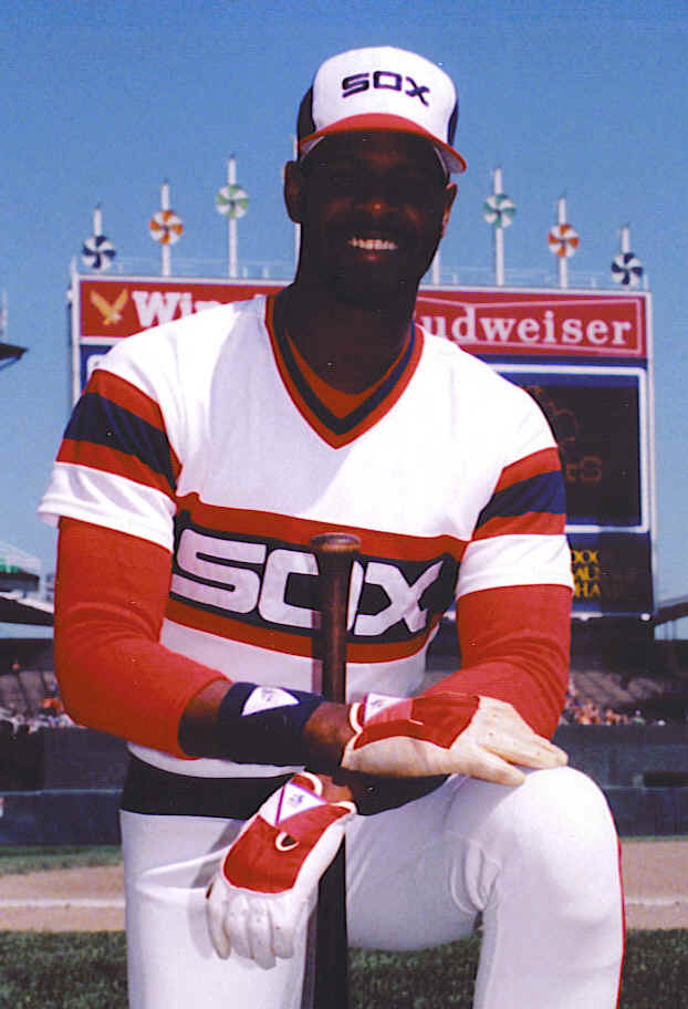
There have been some bad decisions made regarding MLB team logos and uniforms (though the Astros hats are pretty sweet):


There have been some benign, but pointless changes in uniforms (seriously, the first logo is brilliant and I didn't notice is was and "M" and a "B" until I was in college:


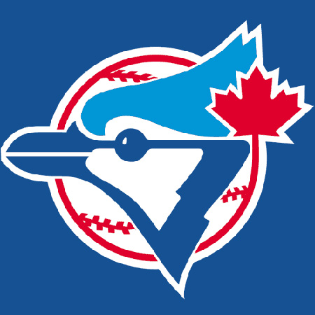
And there have been some changes that feel like the team should be playing a different sport (seriously, the new one looks like the Blue Jays are a football team now):


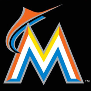
But I'm pretty sure I've never seen anything has hideous as this leaked but supposed Miami Marlins logo

Sure, Florida Marlins never really had a great look to begin with:
but their new logo looks like a Marlin leaping over a mountain range in some horrible Technicolor nightmare. I can't imagine what the uniform will look like (oh wait... yes I can). Doesn't MLB have any say in the matter? Don't the players who have to wear the unis? Judging by the first pictures I posted, I'm going to say no. Playing baseball in Miami just got a whole lot more depressing (provided this is the new logo. Maybe the "leak" is designed to get feedback without putting forth any effort).
I have always dug the Astro's hideously orange unis...
ReplyDeleteThat Marlin's logo hopefully is fake, it is so awe-inspiringly bad that I can't fathom that it isn't a practical joke.
Also: As a fan of the winningest sports franchise in history it is nice that we have only 2 uniforms. Pinstripes at home. Grey for away. They are classic and just look cool.
Your logo has undergone some changes. Don't forget the navy blues. But they have stayed generally the same
ReplyDelete