There have been some bad decisions made regarding MLB team logos and uniforms (though the Astros hats are pretty sweet):

There have been some benign, but pointless changes in uniforms (seriously, the first logo is brilliant and I didn't notice is was and "M" and a "B" until I was in college:

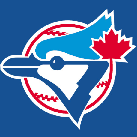
And there have been some changes that feel like the team should be playing a different sport (seriously, the new one looks like the Blue Jays are a football team now):

But I'm pretty sure I've never seen anything has hideous as this leaked but supposed Miami Marlins logo
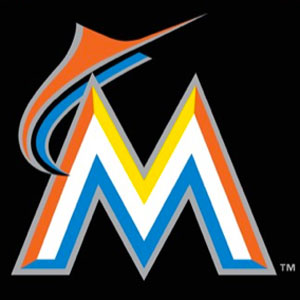
Sure, Florida Marlins never really had a great look to begin with:
but their new logo looks like a Marlin leaping over a mountain range in some horrible Technicolor nightmare. I can't imagine what the uniform will look like (oh wait... yes I can). Doesn't MLB have any say in the matter? Don't the players who have to wear the unis? Judging by the first pictures I posted, I'm going to say no. Playing baseball in Miami just got a whole lot more depressing (provided this is the new logo. Maybe the "leak" is designed to get feedback without putting forth any effort).